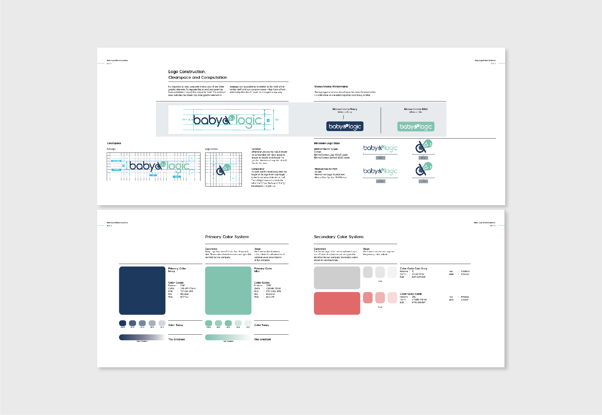
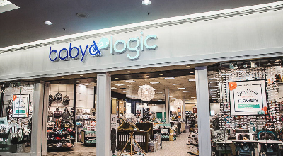
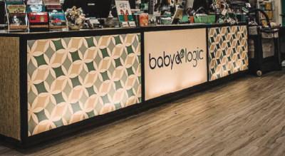
Baby Logic, formerly known as "Bibs and Binkies," was rebranded to position the boutique as a modern, gender-neutral, and franchise-ready retail and parenting resource. The rebrand included the development of a cohesive visual identity, scalable design systems, and storefront elements aligned with the vision for a contemporary baby retail franchise.

The new visual identity was informed by insights from a brand session led by an external strategist, focusing on translating the brand’s personality, values, and positioning into a clear, unified design system.
At the heart of the logo is a hybrid symbol combining a pacifier—representing comfort and security—with a lightbulb, evoking knowledge and innovation. This duality reflects Baby Logic’s core values: education, technology, and safety. A gender-neutral palette of navy and mint,accented with coral and gray, complements bold, modern typography to create a fresh and inclusive aesthetic.
The redesigned identity communicates sophistication and trust. Storefront design, inspired by Pottery Barn Kids, features white wood panels and columns that frame a bright, spacious interior, reinforcing a premium yet welcoming retail experience.


